Flow 01
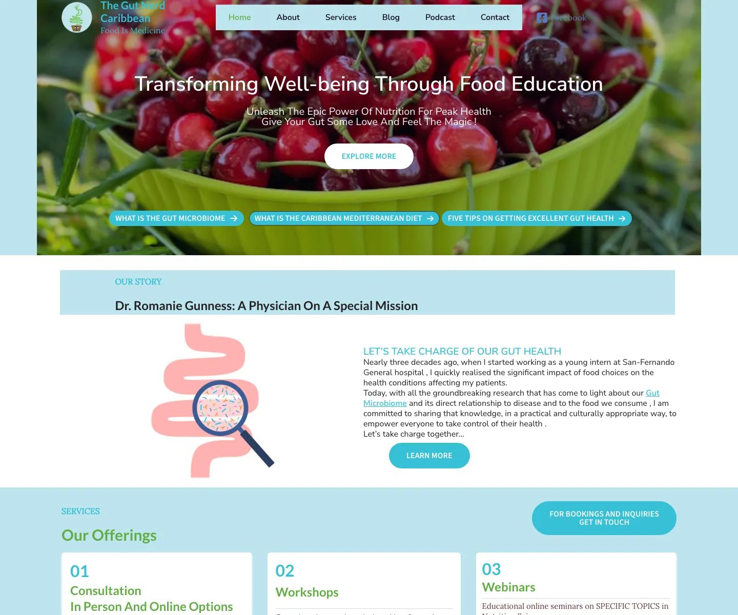
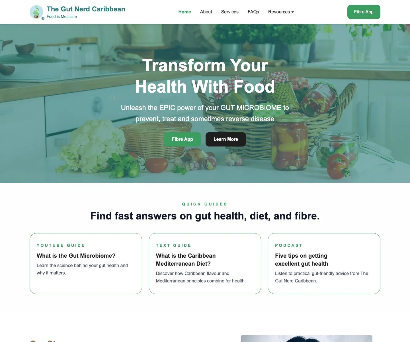
Health education website / Case Study
A welcoming public website that makes gut-health education easier to explore and connects people with practical services and resources.
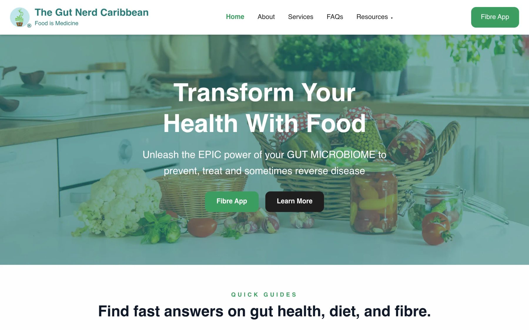
Overview
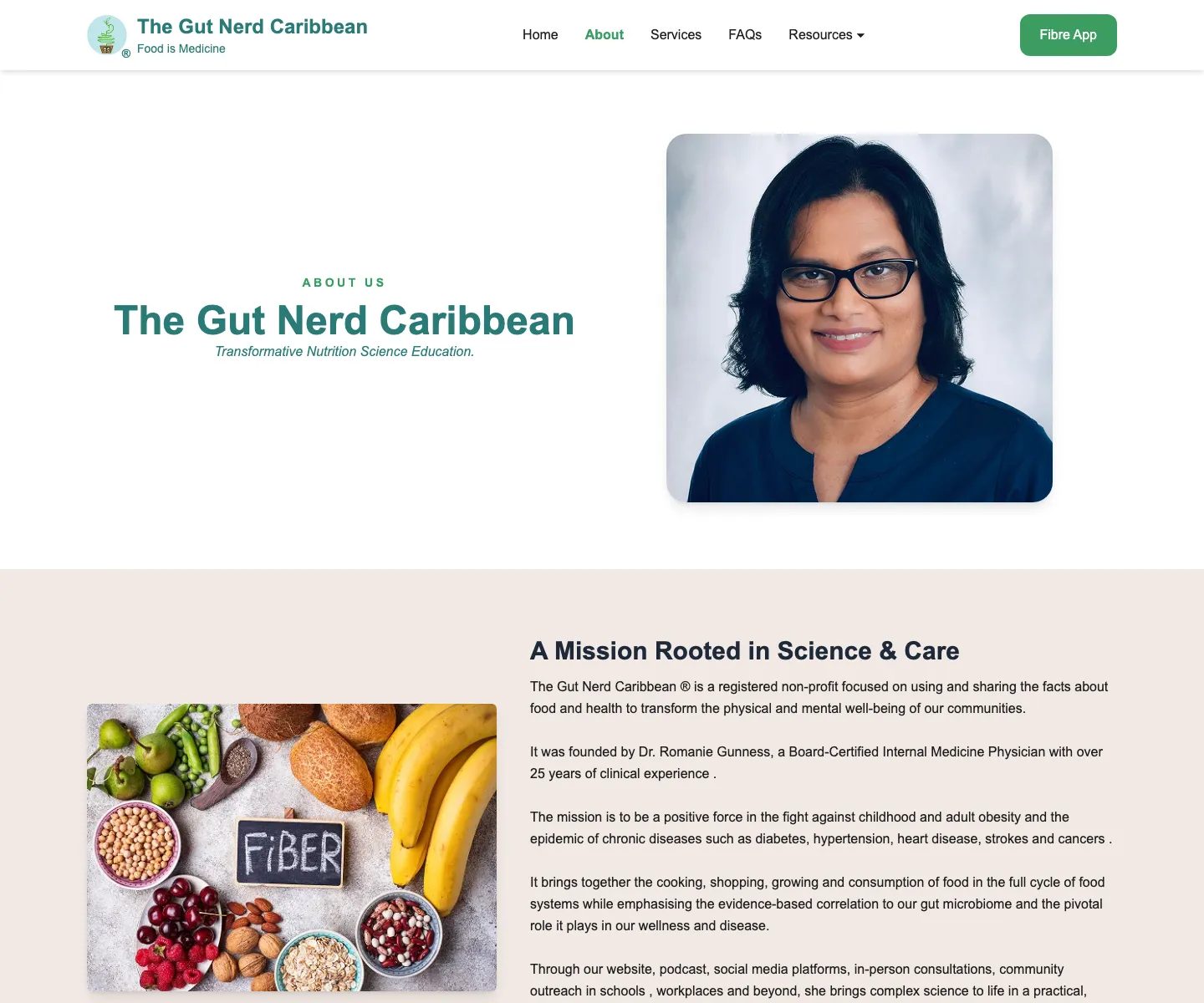
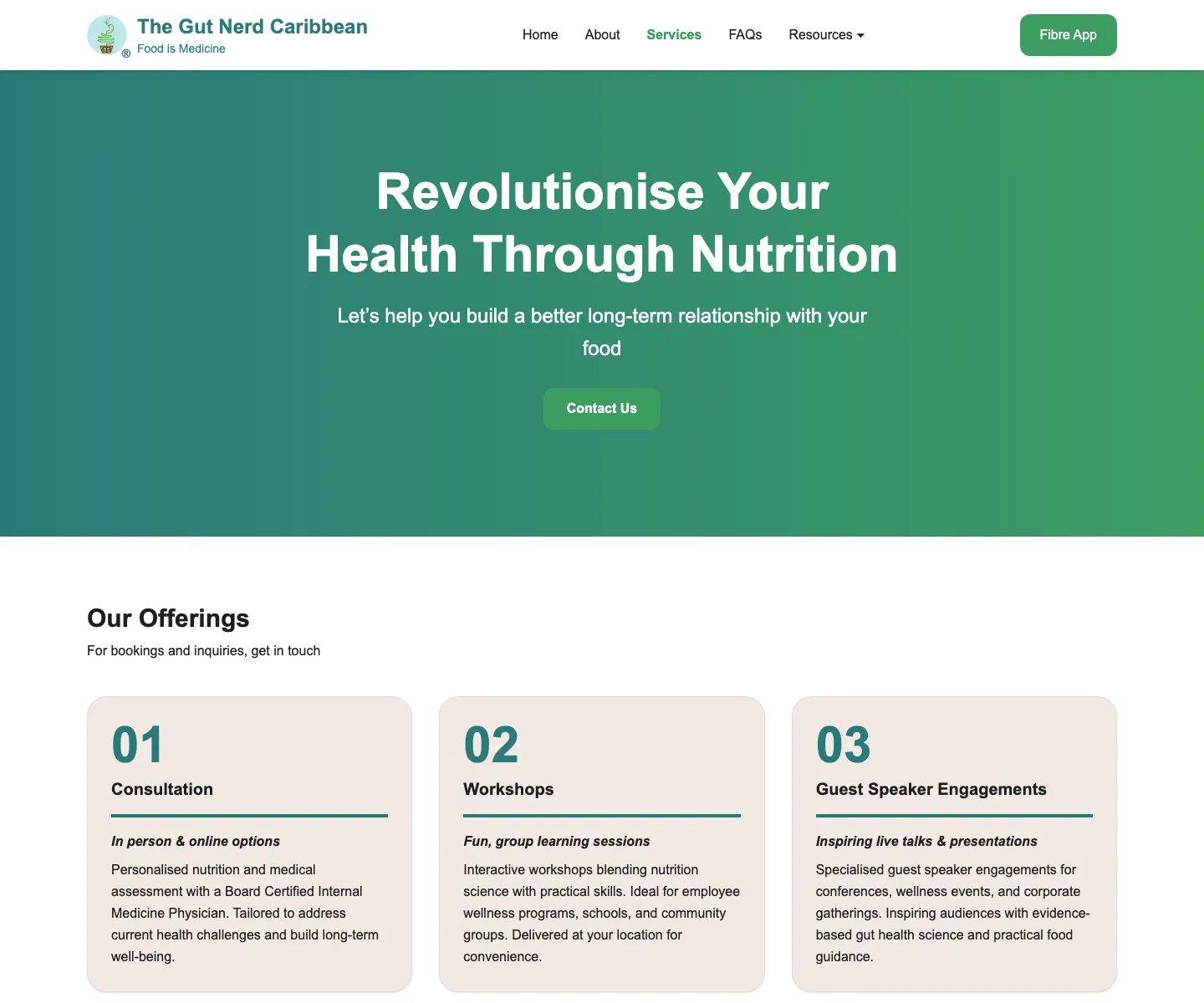
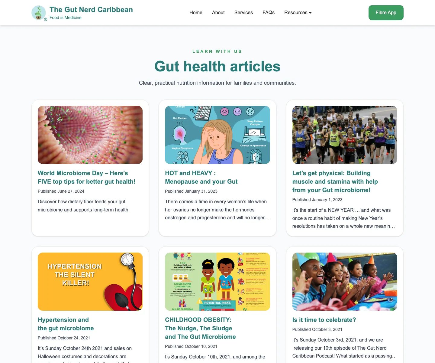
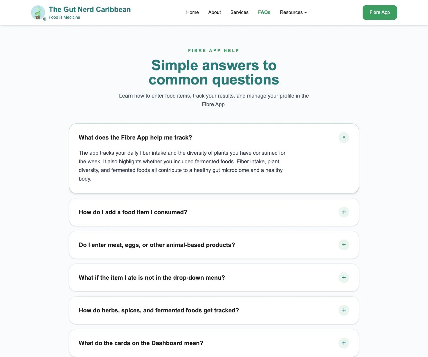
The Gut Nerd Caribbean needed to replace a dated public website with an approachable health education experience for a broad audience, from teenagers through adults in their 50s. The redesign retained useful educational content while making services, recipes, articles, frequently asked questions, and pathways into the companion Fibre App easier to understand.
Challenge
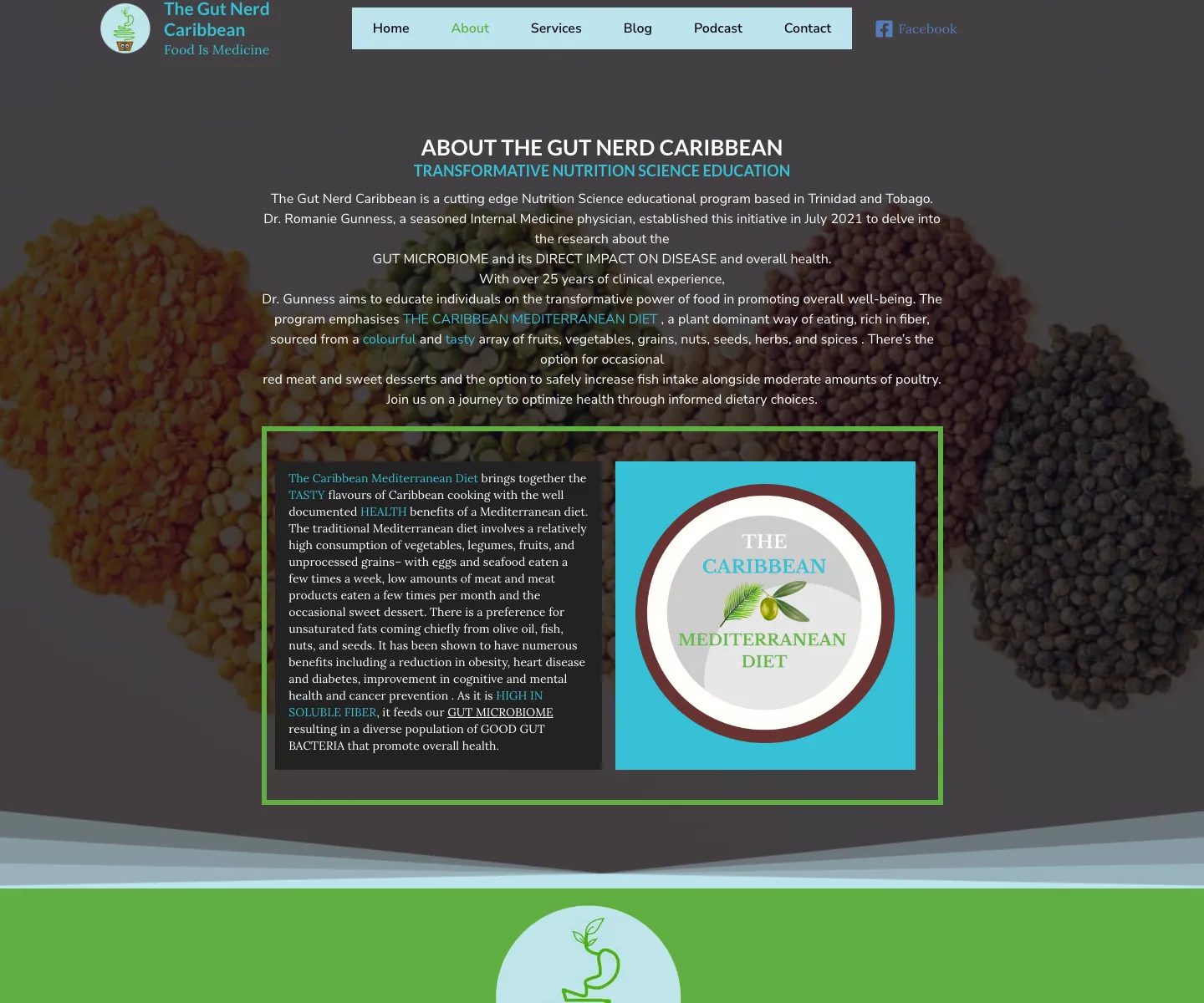
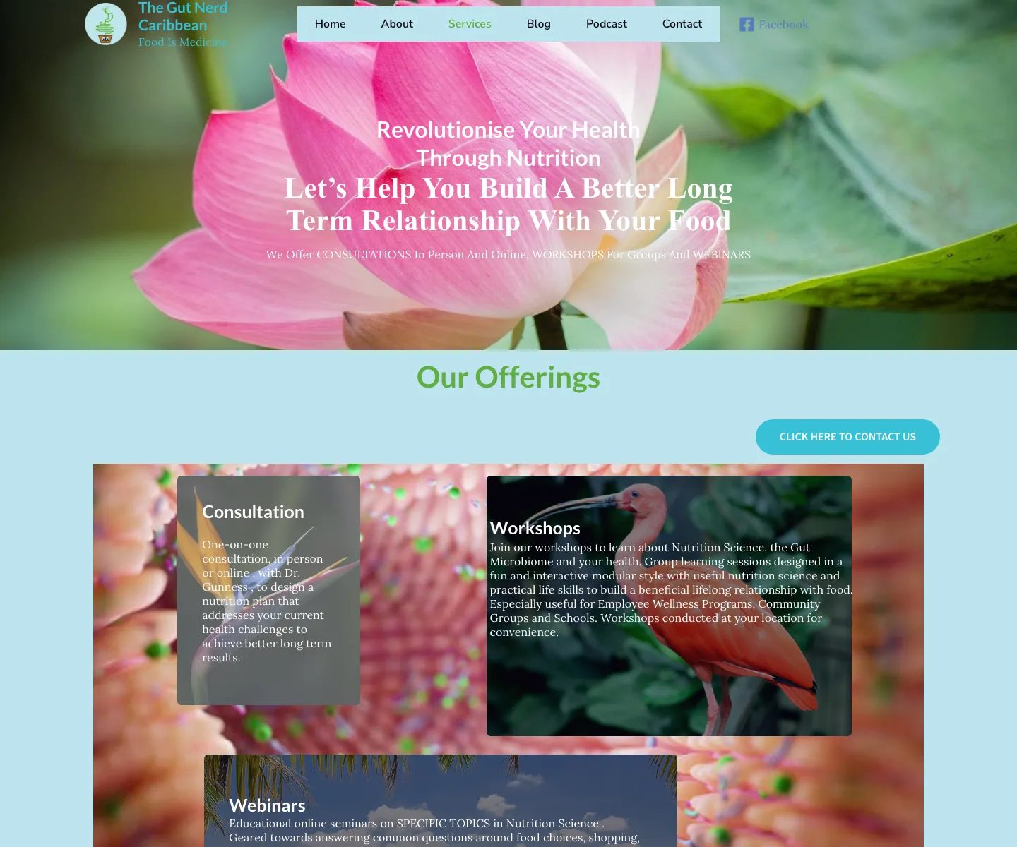
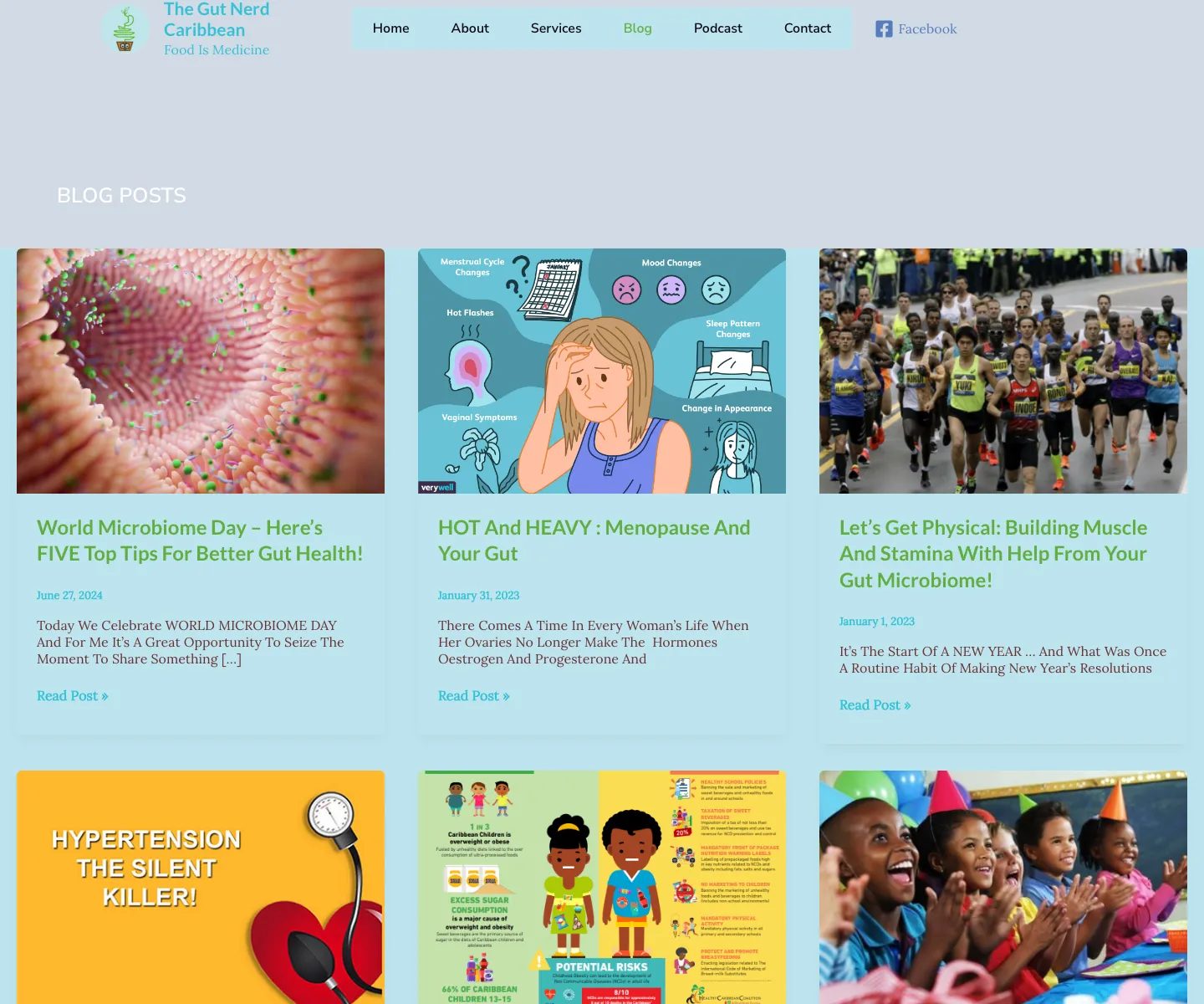
The earlier site used varied imagery and competing content treatments, making important information harder to scan. The redesign needed to organize a growing collection of educational and service content while remaining readable across ages and devices.
My role
I led collaborative discovery with Dr Romanie Gunness, content prioritization, information architecture, wireframes, visual-system direction, responsive website development, and alignment with the companion Fibre App.
Solution
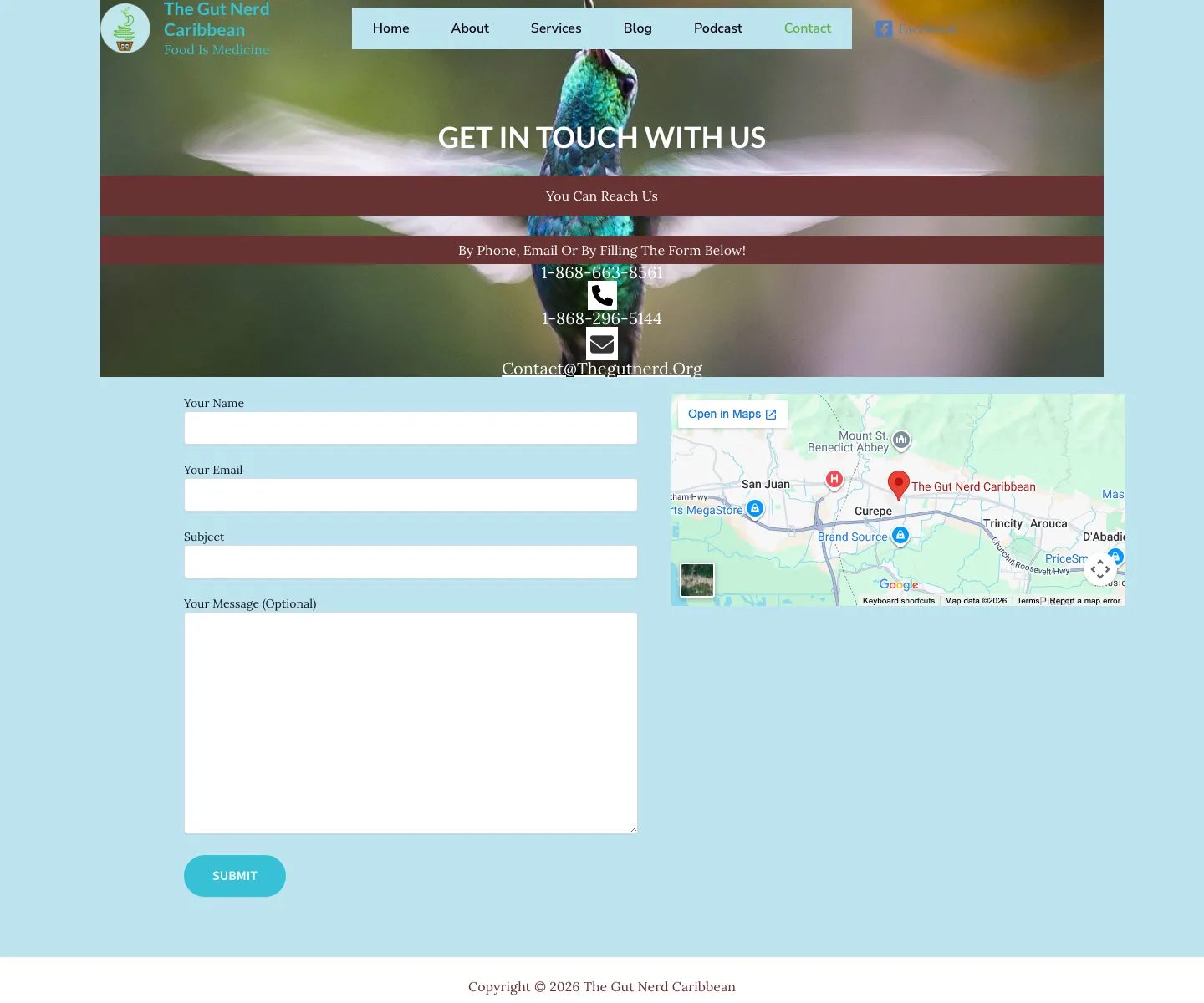
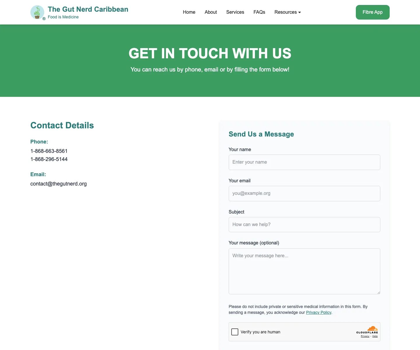
I designed and developed a cleaner website that clarifies the brand's purpose, services, recipes and resources, founder story, frequently asked questions, articles, and app pathways. The redesigned contact experience also provides medical-privacy guidance, links visitors to the Privacy Policy, and uses a security check to reduce automated spam.
Engineering
The completed responsive website uses clearer information architecture, a more readable visual hierarchy, and an inviting tone. The website and Fibre App work as one connected health journey from education toward practical tracking and support.
Outcome
The project created a more coherent website and app ecosystem with a clearer platform for public education and a more direct bridge from learning about gut health to taking practical action.
Key points
Project screens
Flow 01
Flow 02
Flow 03
Flow 04
Flow 05
Related writing